Table of Contents
- 1 Fundermentals
- 2 Principles of Good Landing Page Design
- 2.1 The Primacy of Product & The Concept of Usability
- 2.2 Clarity and the Quest for Fewer Question Marks
- 2.3 The 5 Second Usability Test
- 2.4 Designing High Converting Calls to Action (CTA)
- 2.5 Readability and Visual Hierarchy
- 2.6 Respect Web Conventions/ Expectations
- 2.7 Using Videos, Graphics and Imagery
- 2.8 Information Architecture & Accessibility
- 2.9 Trust, Safety & Creditability
- 2.10 Dedicated Landing Page Design - Best Practices
- 3 Principles of Persuasion: Scarcity
- 4 Design & Building a Landing Page in Unbounce
- 5 Bonus: Landing Page Design Best Practices
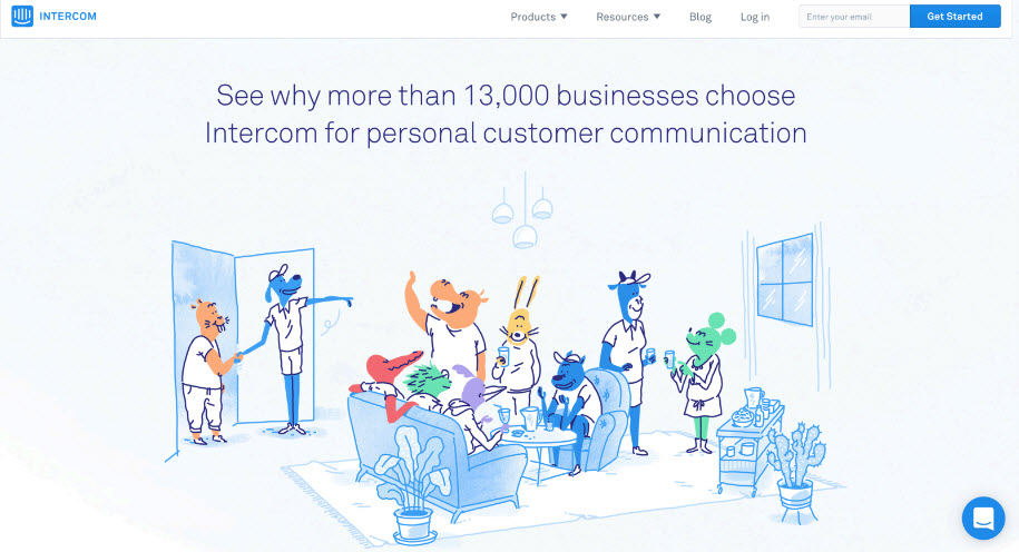
Fundermentals
Introduction
- A
Landing Pageis the first page a visitor lands on toward a conversion goal - A
conversionis a meaningful action that has some sort of value Clarity: The most important element in landing page design
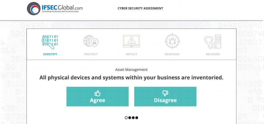
THE 5 SECOND USABILITY TEST
- One of the most famous usability tests
- Quick, easy and cheap
- Quantitative and qualitative data
- How it works
- Show an image for 5 seconds (remove brand recognition)
- Ask some questions
- What is the name of the company?
- What product or service does the company sell?
- What value do they provide to their customers?
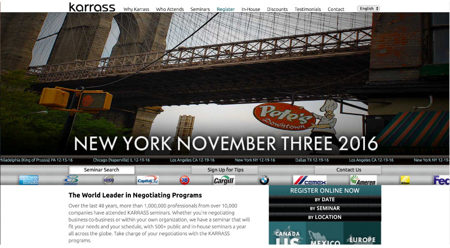
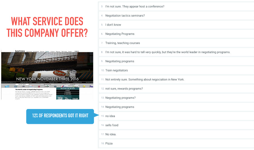
Example: What service does this company offer?
Before: Only 14% of respondents got it right!
After: 48% of respondents got it right!
- The importance of headline and sub-headline
The Myth of the Perfect Conversion Rate
Conversion rate: % of people who start and complete the desire conversion action that you're tracking- Three types of website visitors
- Noes will never convert because they can't afford, casual browsing etc
- Yesses will always convert have have high commitment
- Maybes: The majority, Landing page optimization (LPO) greatest potential for influence
- Yes-maybe (LPO)
- maybe-maybe (LPO)
- maybe-nos
Conversion ceilingi.e. the maximum conversion rate you want to achieve is well below 100%- Include: Yeses + Yes-maybes + maybe-maybes
- Exclude: Noes + may-nos
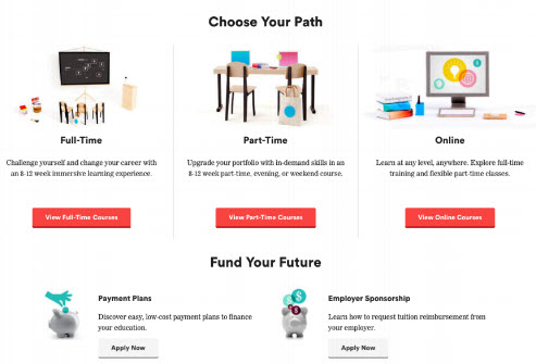
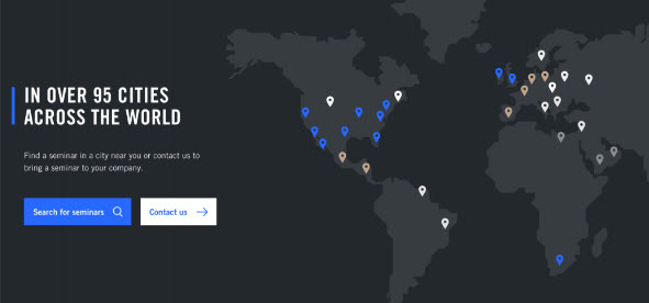
The 3 Main Types of Landing Pages
Primary Site
- Any page on your website
- Most dynamic experience/info
- High Attention Ratio
- Bring in new customers
- Example 1
- Example 2
Microsite
- Modified/ truncated version of main site
- Focus on limited products/ services or conversion actions
- Still provide contexts (info, options)
- Medium Attention Ratio
- Typically newsletter sign-up, specific sales, with form submission
- Design
- Long single scroll page
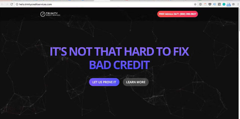
- Example http://hello.trinitycreditservices.com/
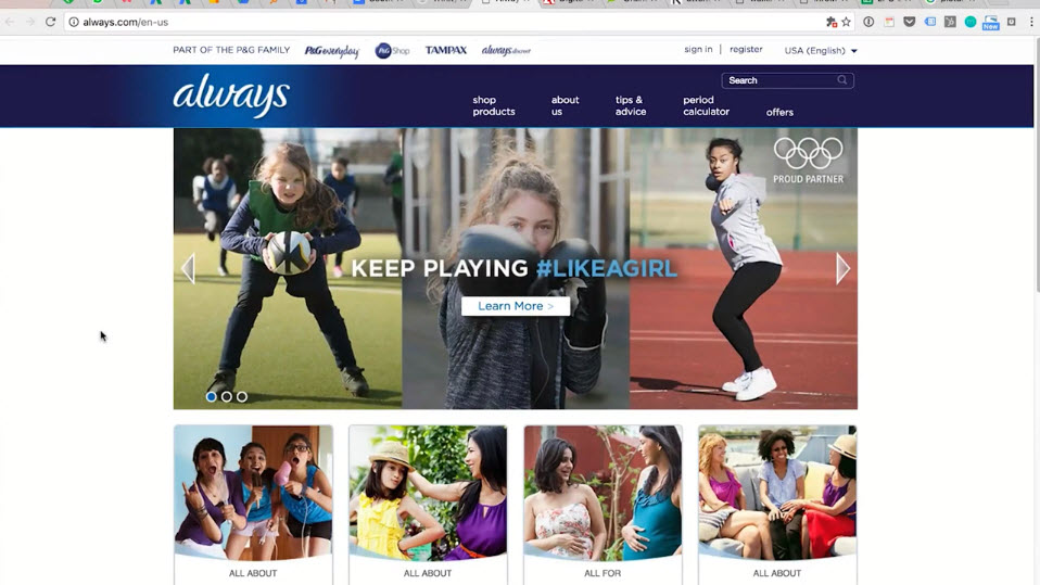
- Example https://always.com/en-us
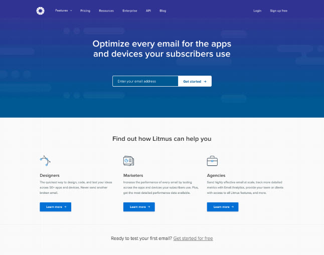
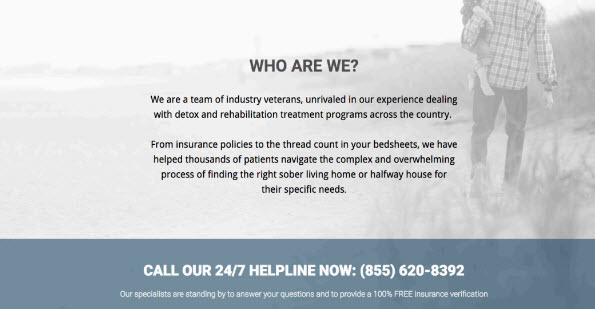
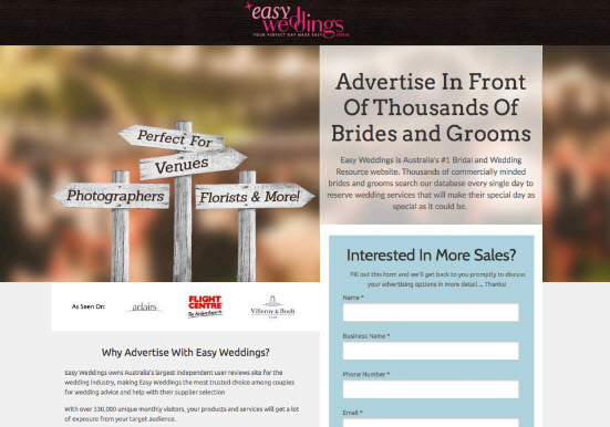
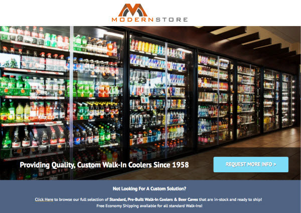
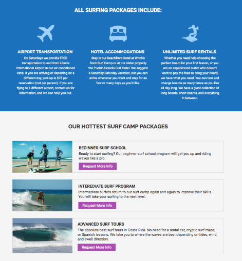
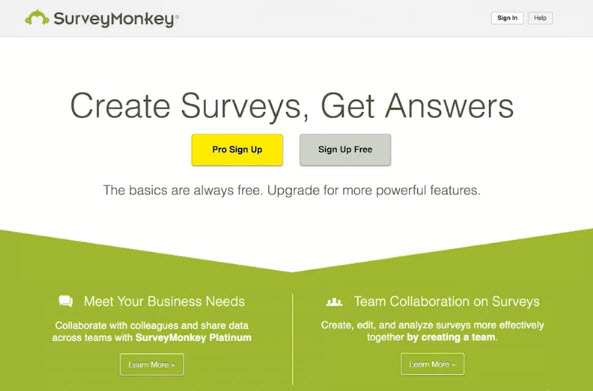
Dedicated Landing Page
- Most popular for marketing campaigns
- Immediate/ urgency
- Very effective for single product/ service
- Low Attention Ratio
- Design:
- No navigation or with very few links
- Clear Call to Action (CTA) with one conversion action
- e.g. form submission, contact form, newsletter sign-up
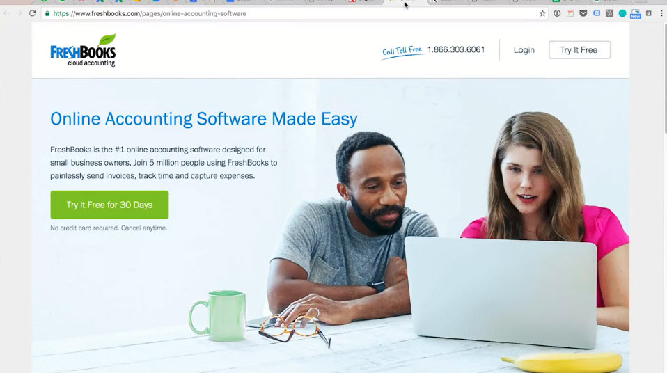
Example https://www.freshbooks.com/
Example 2
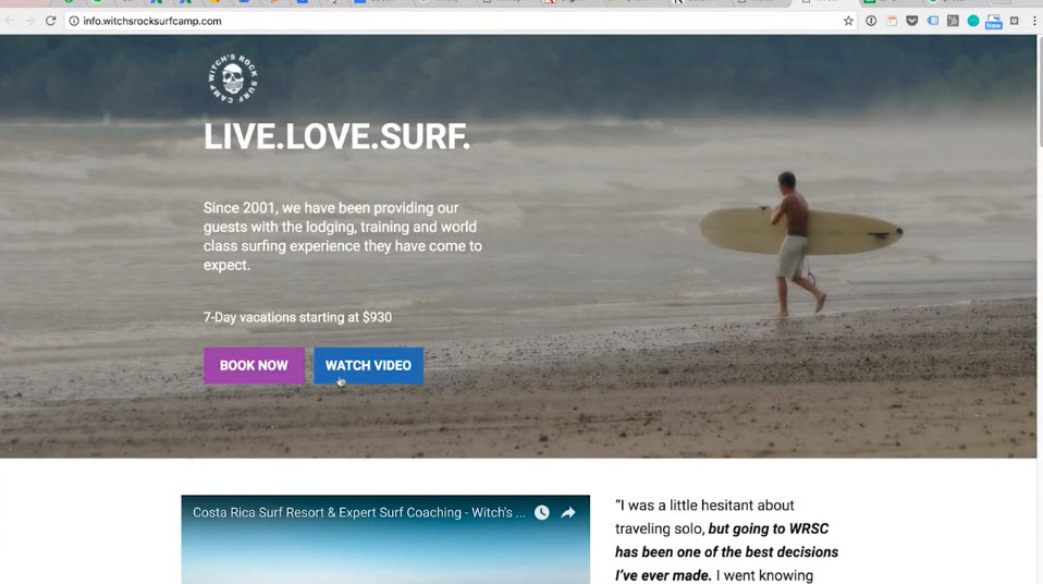
Example 3 http://witchsrocksurfcamp.com/
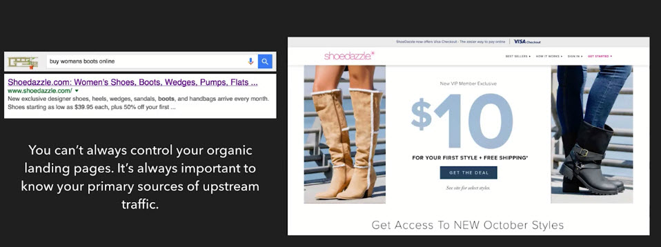
Attention Ratio- 1:1 means 1 conversion action (click) with 1 link
You can’t always control your organic landing pages. It’s always important to know your primary sources of upstream traffic.
- Example
- Example
Common Business Models & Conversion Actions
Conversion= action that is measuable and has a valueDifferent Business Models
E-commerce
- Selling stuff online
- Requires high commitment
- 1-2% avg conversion rate
Lead Gen
- Promote service
- Accountant, Attorney, Universities
- Primary CTA: email/ form/ content (e-book, white papers)
- Requires less commitment
- Longer sales cycle, nurturing
- Promote service
Publishers
- New York Times, Wall Street Journal
- Ad revenue/ free content
- Premium subscriptions
- Common form of
Conversion Actions:-- Page views
- TOS (time on site)
- Frequency of visit
- Ad
CTR (click through rate)
Blogs
- Personl/ prof
- Converson actions
- Newletter sign-ups
- Social shares
- Comments
- Ad revenue/ upsells
- Affiliate products via Amazon
Desire Conversion Actions
Sales
- Most complicated..simplier with one product
- LTV (life time value), revenue per visitor, margins, loss-leaders
Subscriptions
- For Publishers, Blogs
- Decline in ad revenue , increase freemium/ premium subscriptions
Form Fill Rate
- For Lead Gen
- % start + finish a form
- Length, sensitivity, complexity, deliverables, time to complete
Downloads
- E-books, White Papers, case studies w/o form
- % of visitors who download the content
We don't live in a single conversion world
- Most websites value multiple actions
- Every page should have just one primary conversion action, don't give 2 actions the same visual weight
- Multiple contact options, OK! But be clear on the best option
Good design has one converion in mind
- The primary conversion action and secondary convesion action are mutually exclusive
- Aware of your product vs Add to shopping cart
Exercise
- 2-3 valuable conversion actions your visitor might take
- 3 key pages -> identify primary converstion action
- Conversion actions in 1 & 2: Measurable & have a clearly defined value?
The AIDA Sales Funnel and the Online Decision Making Process
AIDA Sales Funnel
- Foundation of modern sales teams
- 1898 Elias St Elno Lewis - U.S. insurance market
- Funnel: As you get to the bottom of the funnel, you have fewer and fewer people who converts (take action)
Every buyer goes through 4 main cognitive phases:-
- The first 3 stages are due to extrinsic stimuli in the environment:
- Awareness
- Interest
- Desire
- Action -> natural result
Prospects need different treatment & different information based on where they are in the funnel
More complex today, but still essential
Length of cycle can vary greatly e.g. cars
AIDA to website visitors
- by Andrew Chak(2002)
- Browsers = awareness
- Casual browsers
- Evaluators = interest
- Comparison shoppers
- Transactors = desire
- Customers = action
Recurring questions in customer mind in all 4 stages
- Do you have what I want?
- Why buy from you? (5 seconds test!!)
Awareness Stage: Where It All Begins
- Spreading awareness should be done via permission marketing e.g. trading free value for engagement and attention
- New visitors are low on commitment and are looking for reassurance, value and clarity
If you can’t clearly communicate what you offer and the value it provides your customers, there will be no interest
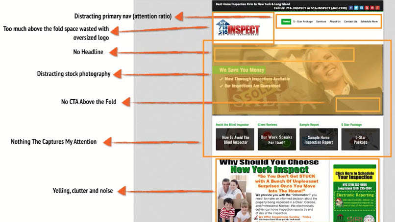
STOP SCREAMING AND BE STILL
- Your page should evoke a sense of calm and stillness
- Not every element deserves emphasis. The more things you emphasize, the less attention your Call to Action (
CTA) will get - No gaudy or flashy visuals or overly-bold color schemes
- Make things easy to find. If new visitors can’t find it easily, it may as well not be there at all
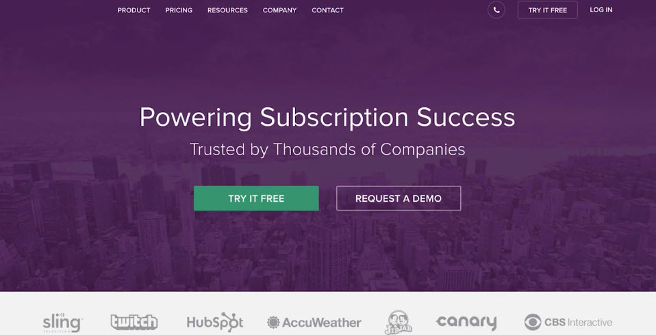
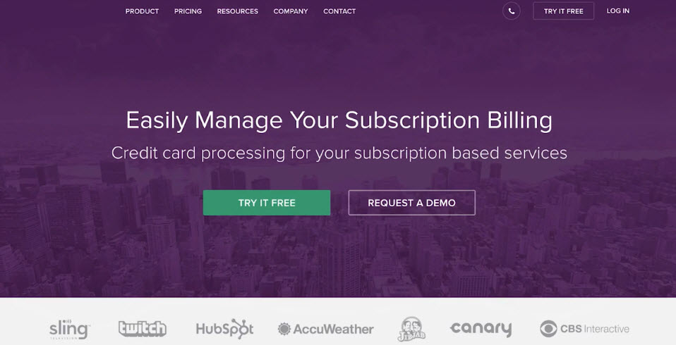
Bad Example
Good Example
YOUR WEBSITE ISN’T A CANDY STORE AND YOUR VISITORS AREN’T KIDS
- Too many things to clicks on create unnecessary distractions.
- Any emphasis on a secondary conversion actions detract from primary conversion action. Each page needs to have just one primary conversion goal in mind.
- Supporting copy needs to be relevant and relatable.
- The primary conversion goal is your most valuable - it should have the most visual prominence.
WE JUST MET … STOP TALKING SO FREAKING MUCH
- Generating awareness is about capturing attention quickly - don’t write hyperbole and jargon. You like it - they don’t.
- Unclutter the elements of your page. Use white space, padding and margins to give a sense of hierarchy and readability to your content.
- Clear headlines and sub headlines
- Clearly defined action block (more about this later)
Example
Interest Stage: Tell Me More
- More similar to awareness than desire (not highly committed yet)
- Can be accomplished with a fleeting level of attention toward one particular element on your landing page
Interest is always self selected … you won’t ever convince anyone that they should be interested in what you sell (marketing is for the last two stages)
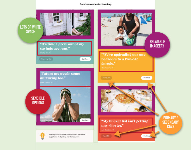
INTEREST: PERSON-BASED SELECTION
- Give your visitors a chance to self-identify (based on their characteristics and roles)
- Gives users clarity and context and helps them make a decision where to click to explore more
- Example: General Assembly - Self selection on their homepage
INTEREST: NEEDS-BASED SELECTION
- Allow users to identify with a particular need they are looking to meet
- Increases in interest by offering contextual and relevant information with little cognitive strain.
- Person based selection is usually more effective and relatable, but depends on your business
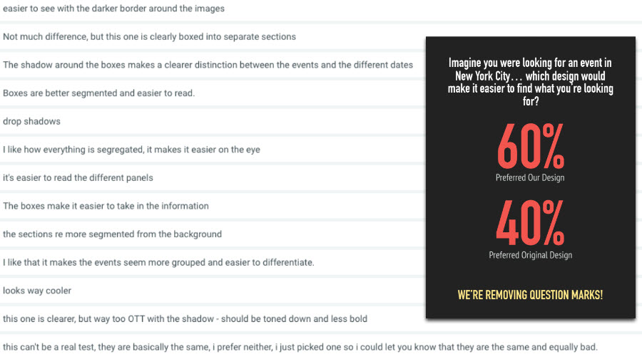
THE PREFERENCE USABILITY TEST
- Gives users more time to evaluate two different design iterations (images)
- Give participants specific instructions and context (what, who, why) and ask them which one they like better?
- Great test for getting an objective measure of clarity and for figuring out which approach is more effective for your specific pages
- Test: person-based selection or needs-based selection?
- Needs-based
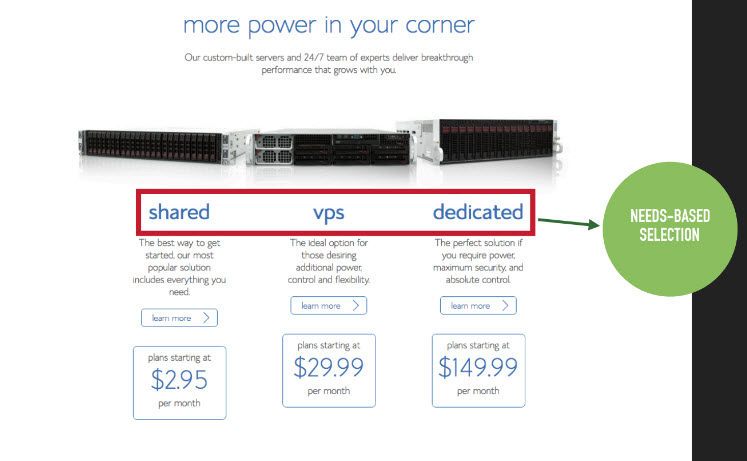
- Person-based
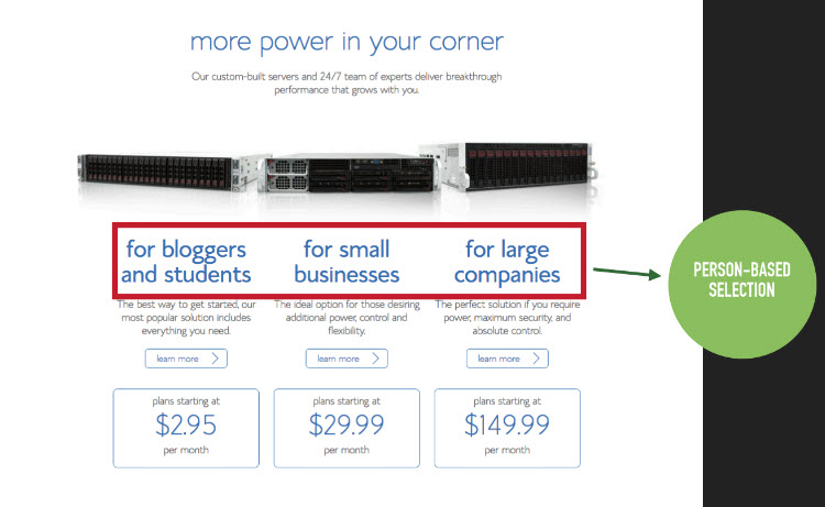
- Results: Wow!
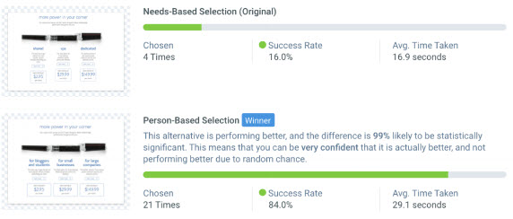
- Needs-based
Desire Stage: I Want What You Have
- Visitors are more committed to what you sell and are going to give you more time and attention
- Just because a visitor is more engaged doesn’t mean you can compel to them act before they are ready
- You need to make sure you provide enough supportive information, filling in the blankspaces.
This is when visitors may transition from scanning to reading.
TRUST AND SECURITY
- One of the greatest deterrents of conversions is a lack of safety and trust …remember, your visitors don’t know you.
- As visitors develop a desire for your products or services, they’re looking for transactional assurances and social proof.
- Visitors should be allowed to determine the pace and direction of their relationship with your brand.
- Example: UXpin https://www.uxpin.com/
- Great header
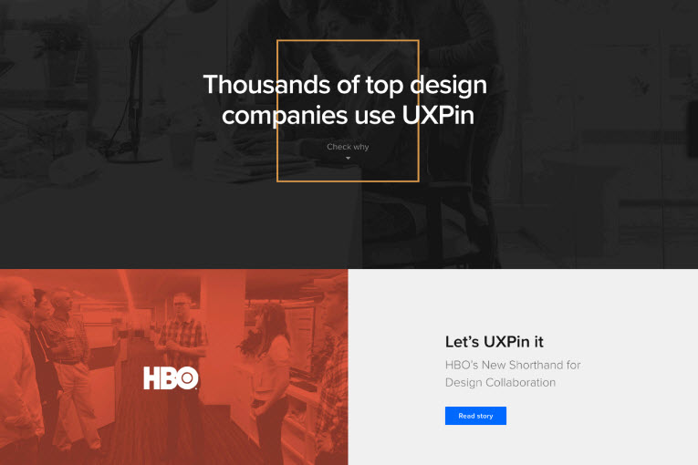
- Case studies
- Testimonials
- Logo bar + CTA
- Great header
- A beautifully designed page that lets users learn more about the product while giving a sense of trust and safety
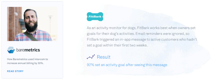
COMMON “DESIRABLE” ACTIVITIES
- RESEARCH
- Visitors want to learn more about your products … prioritize information based on how essential a given feature is.
- Facilitate the research process with whitepapers, ebooks, charts and infographics, checklists.
- Product filters!
- COMPETITIVE ANALYSIS
- There’s usually more than one alternative to buying essentials the same thing from you.
- You should have a clear sense of your competition and figure out how you can differentiate yourself.
- Tie-breakers are skewed based on number of competitors or additional value.
- SOCIAL IDENTIFYING
- Peer to peer reviews and recommendations are the most trusted source.
- Reviews, ratings and case studiesare very powerful elements in social proofing. Bad reviews are OK.
- Most important aspect is if prospects can identify and relate to the same people leaving feedback
- RESEARCH
Action Stage: I'm Buying What You Sell
- Natural result if the previous stages in the funnel have been passed
- You can do everything right and still not convince a customer to transact (can’t afford … the noes)
- Products and services are different - Products need tangible support, services usually need more emotional support.
Whether a contact form or a checkout process, don’t make your visitors jump through any unnecessary hoops.
- Before
- After
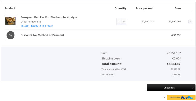
- Amazon
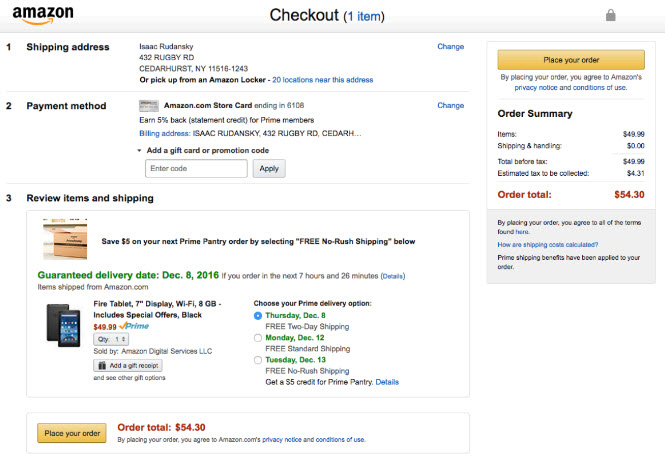
- Before
Make things easy. simplify choices. Remove irrelevant distractions. omit unnecessary words.
- Before
- After: Use pop-up form
- Before
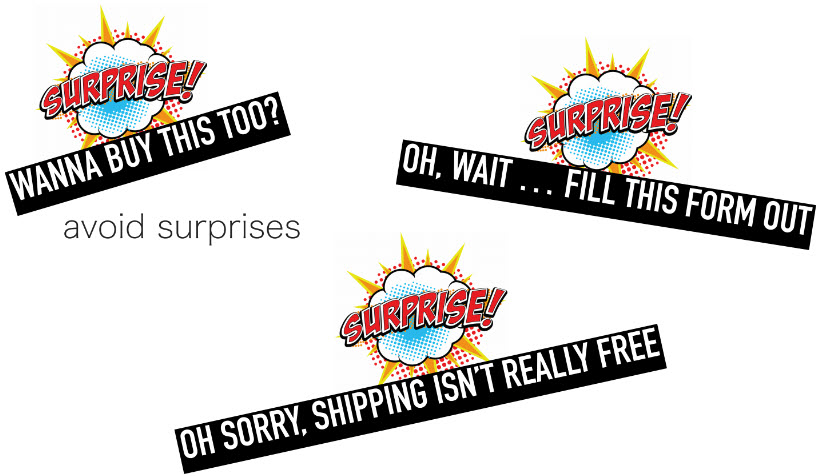
Lastly, avoid surprises!
The Fogg Behavior Model
- Introduced by BJ Fogg who founded the Persuasive Technology lab at Standford University
B = MATat the same timeBehavior can occur when 3 things converge in a person at the exact same time:
- Motivation
- Sensation
- Desire for pleasure; Avoidance of pain
- Anticipation
- Anticipate sensation
- Social cohesion
- People want to be part of the group
- Sensation
- Ability
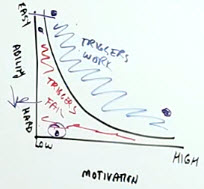
- Make things simplier decrease perceived difficulty
- Trigger
- Facilitators
- High on motivation but low on perceived difficulty e.g. car lease
- Sparks
- Low on motivation but high on perceived difficulty e.g. newsletter sign-up
- CTA needs to increase value, increase motivation
- Signals
- Half way in between for both motivation and perceived difficulty
- Facilitators
- Motivation
Making Your Landing Page Design Memorable
The Limbic System
- The second half of the brain to evolve
- Responsible for emotion, attention, affective responses and memories
- Value Judgements
- Avoid pain/ pursues pleasure
- Spontaneous Behavior
- Good design taps into the limbic system and make it memorable
The Ways We Learn
- Visual
- Imagery, colors, tables, infographics, videos, tours
- Audio
- Voice-overs, music, video, telephone
- Kinesthetic
- Quizzes, games, role-playing
- People tend toward one modality
- There is no best way
- Should not interfere with good design
- Especially important during desire & interest stages
- Visual
Principles of Good Landing Page Design
The Primacy of Product & The Concept of Usability
- Nothing is more important than having a product that people want to buy and that people need
- Could be products or services
- Consultative vs commodities
- Services can be commoditized or consultative in nature. Knowing the type of service you are will impact your approach to marketing.
- Products are the same. Unique vs Commodities. Does everyone else sell the same thing?
- Commodities have an extrinsic value system, determined by the marketplace.
- Consultative businesses and unique products have an intrinsic value system based on the perceived value of the client / customer, and the self determined value of the agency or seller.
Example: Commodities
- High level of practical detail
- Very little emotional focus
- Not about the value to the customer, it’s about the features of the product
- Price is greatest determinant in a commoditized world
Example: Consultative/ Unique
- Consultative leans more toward the emotional payoffs to the customer
- Subjective value
- How well can you tap into your prospects’ fear and emotional needs
Usability
- Broad perspective, every page of your website should be able to account for the following factors:
- Useful: Does it fill a need that your visitors have? Does it answer the questions your visitors want answered? Does it do something worthwhile that your visitors need done? Useful information, useful context, useful calls to action
- Learnable: Can your visitors figure out how to use your website without additional instruction? Is it self-explanatory?
- Memorable: Will visitors have to relearn how to use your site each time they visit? Is it unique in a way that your visitors will remember you as they continue to browse competitors and evaluate other options?
- Effective: Can users actually accomplish their tasks on your site? If your site sells something, can users buy it and buy it easily? Are their clear contact options?
- Efficient: Can users get the job done with as little resources and mental energy as possible? Does it take users too long to accomplish their goals (page load speed)? Inefficiencies are inexcusable because they can usually be fixed easily.
- Desirable: Do people want it?
- Delightful: Is there an experiential element to your website and landing pages that make the visitor feel excited about your products and services? Is your website fun and enjoyable to browse and look at?
“A person of average ability and experience can figure out what you do and how to use your website without it being more trouble than it’s worth”.
- Steve Krug
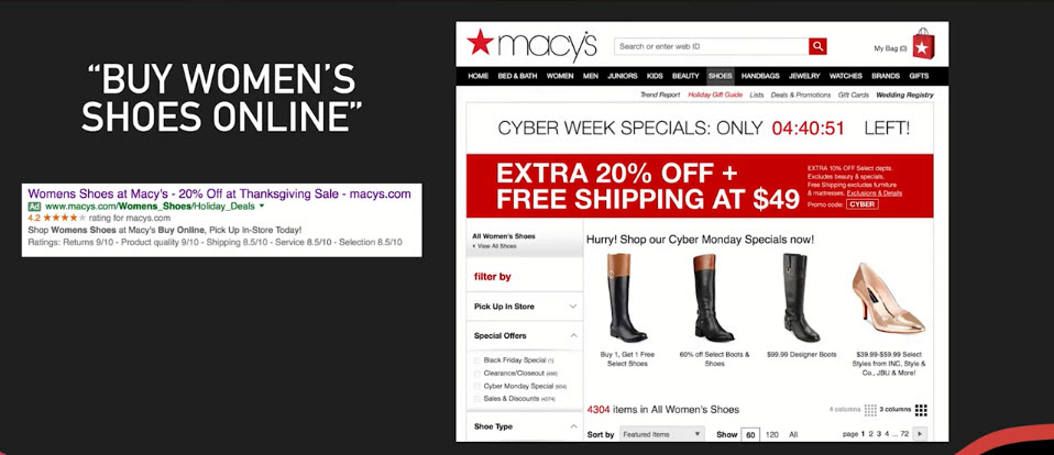
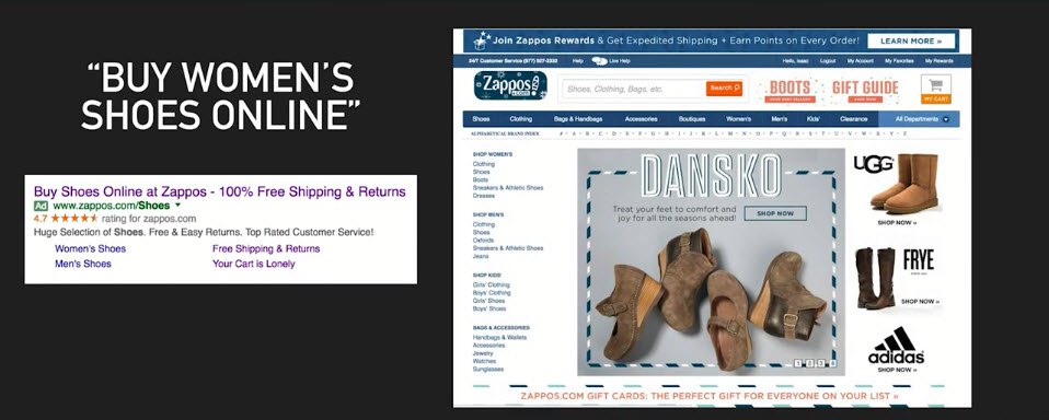
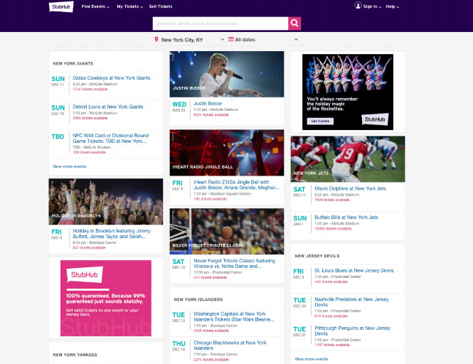
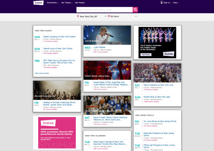
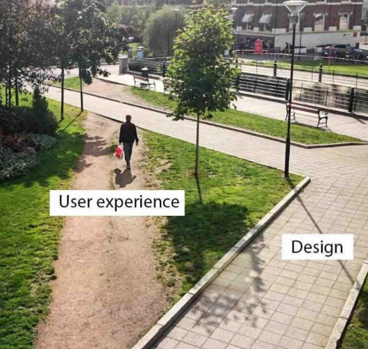
Clarity and the Quest for Fewer Question Marks
CLARITY AND SIMPLICITY = LESS THOUGHT
- Don’t Make Me Think (Krug)
- Most importantly applied when a visitor first lands on your website or landing page
- Things should be self evident. If not, then self explanatory
- The old lady should know
- Forget about competitors being a click away. You want the satisfaction and to avoid the subtle frustration
Example: Good Design
Example: Bad Design
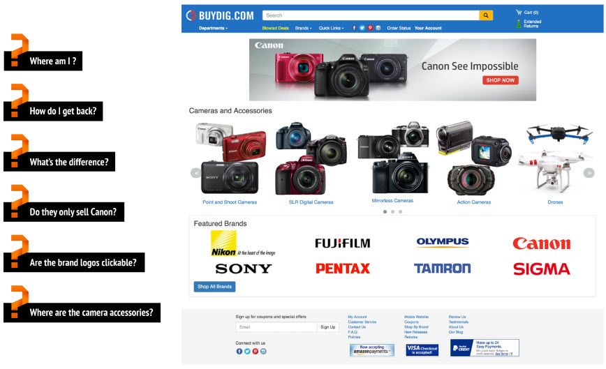
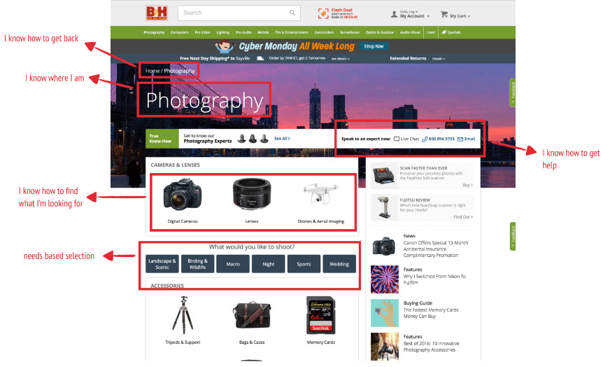
Questions You Should Always Ask About Your Website
- Do I know where I am?
- Can I find my way back?
- Can I easily find what I'm looking for?
- Can I self-select?
The 5 Second Usability Test
THE 5 SECOND USABILITY TEST (CONTINUED)
- Study published in 2006 in the Behavior and Information Technology Journal shows that you have half a second to form a visual first impression. That means you don’t have much longer than that to convey to users what you do
- 3 most popular test questions
- What is the name of the company?
- What does the company sell?
- What value do you provide to your customers?
- e.g. selling vaccum: a cleaner life
- The purpose of the 5 second test is to have your customers write your headline for you
- Headlines / sub headlines … why do so many get it wrong?
Example
More examples in the video
Designing High Converting Calls to Action (CTA)
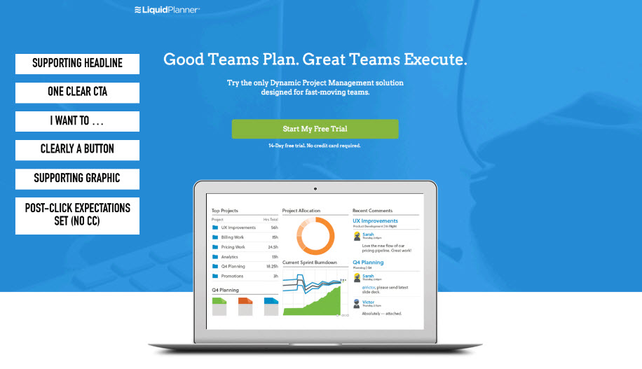
THE ART AND SCIENCE OF A GOOD CALL TO ACTION
- Have a CTA on each page
- Support it with your page headline
- Be cognizant of your attention ratio
- Don't make user hunt for it (above the fold when possible)
- Set expectations
- "I want to..." (not "Submit")
- Respect the action block
Example: Good CTA Design
Example: Attention Heatmap
Bad
Attention Headmap
- Where your eye will be drawn
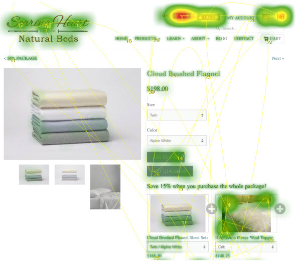
- Where your eye will be drawn
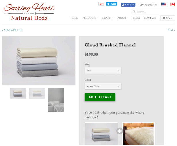
Better
Attention Headmap (with social share links)
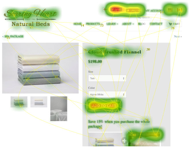
Attention Headmap (WITHOUT social share links)
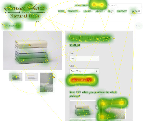
Example: No CTA
Landing Page (with CTA)
Sub-page (No CTA)
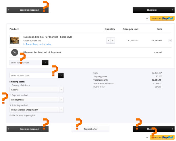
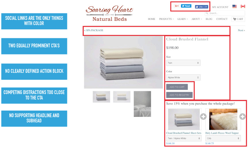
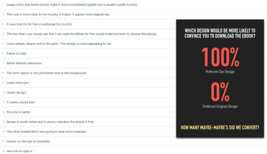
Example: Asking for too much info
Original
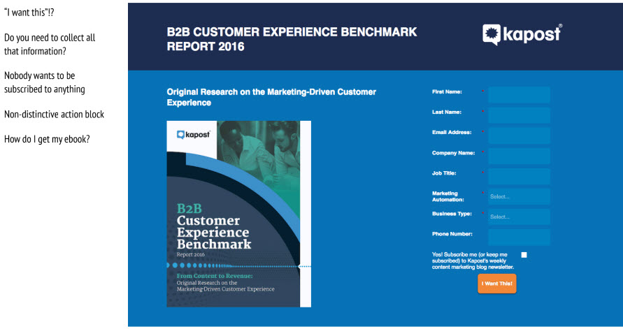
Better
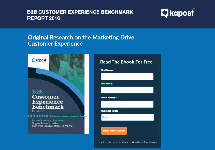
Result
About Button Design
- More gradient/ shadow, more clickable
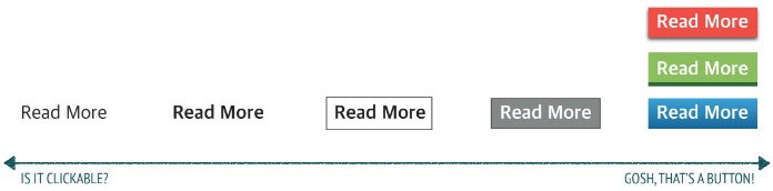
- More gradient/ shadow, more clickable
Readability and Visual Hierarchy
“How Users Read On the Web: They Don’t” - Jakob Nielson
- People glance and scan … they don’t read (especially early on)
- We’re busy, we don’t need to read it all, and we’ve been conditioned to scan
- Scanning is how we find what’s relevant to us
- The user perceives your site more like a billboard than a book
Users will focus on things that match what they think they’re looking for (and trigger words)
DESIGNING PAGES FOR READABILITY
- Create visual hierarchies - the inverted pyramid
- Use bullet points and highlight/ bold key terms
- Short paragraphs. Very short.
- Don’t write in full sentences
- Use headlines on every page to give the user a sense of orientation
- Avoid jargon and hyperbole … fewer adjectives, more objectivity
- Focus on the essential information that your visitors need
- Keep it simple: 8th grade reading level, fewer acronyms, simple vocabulary
Important things should be more prominent
- Hide longer paragraphs in tabs and in popovers
- Distinguishable by color, size, weight, padding and / or location on the page.
- Complete sense of dislocation: What's going on?
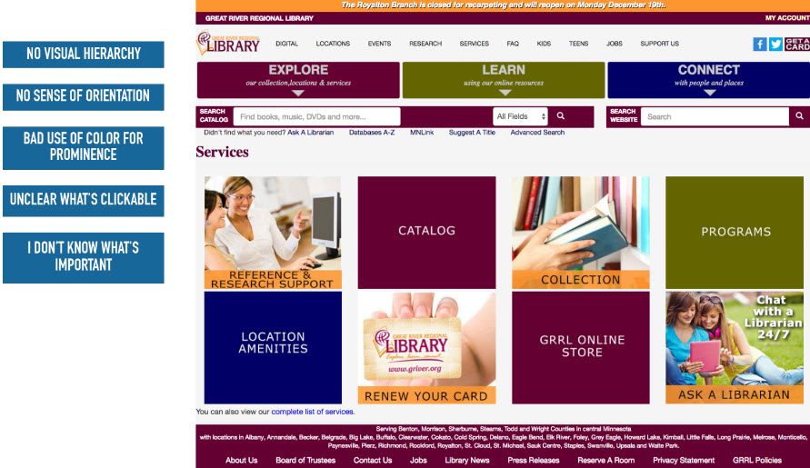
Use Grouping to Create Structure
- Use headings to group similar items and themes
- Create different visual styles for different groups of related items and topics e.g. button
- Put similar elements in clearly defined containers on your site
Creativity and Innovation Need Not Suffer
- Color, Headers, and Visual Hierarchy all combine to create a simple, but creative experience
- Color, Headers, and Visual Hierarchy all combine to create a simple, but creative experience
Visual Hierarchy
- Original design
- Modified
- Survey Results
- Original design
Example Readbility
Long paragraphs, clutter and yelling. BAD.
Short paragraphs, bullet points, no yelling. GOOD.
FORMATTING YOUR HEADINGS FOR READABILITY
- Headings give organization and structure to your page
- Obvious visual distinction
- Consistency - each heading level throughout the site should indicate a consistent level in the importance scale
- Don’t float your headings. Closer to the text that comes after, further away from the text before it.
Respect Web Conventions/ Expectations
Consistency is one of the most powerful usability principles: when things always behave the same, users don't have to worry about what will happen. Instead, they know what will happen based on earlier experience.
The more users' expectations prove right, the more they will feel in control of the system and the more they will like it. And the more the system breaks users' expectations, the more they will feel insecure.
Jakob's Law of the Web User Experience states that "users spend most of their time on other websites."
This means that they form their expectations for your site based on what's commonly done on most other sites. If you deviate, your site will be harder to use and users will leave.
https://www.nngroup.com/articles/top-10-mistakes-web-design/
"The Design of Everyday Things" by Don Norman states that only break a convention when you are absolutely certain that there your new way of doing it is just as evident, or that your new way of doing it is so valuable that it justifies some degree of user frustration
The only way to answer those questions is with actual user testing ‒ not with your own predictions
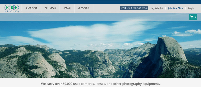
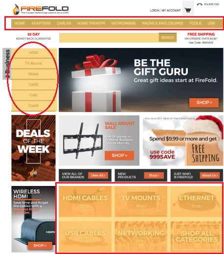
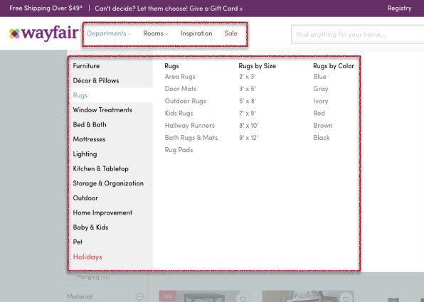
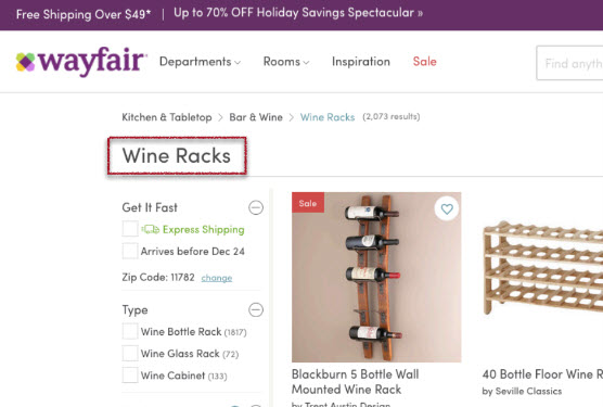
Common Web Conventions
- Logo
- Always at upper left corner and click back to your home page
- Navigation*
- Span across the top of the page
- Secondary Navigation*
- Also called Local Navigation
- Left hand side of the page
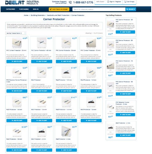
- Commonly used in e-commerce catalog as afilter or local navigation for additional services
- Shopping Cart Link*
- At upper right hand corner for e-commerce
- Utilities*
- Such as About Us, registration, log-in, my account, faq, contact phone number
- Usually smaller and above the navigation
- Any text that you underline has to be a link
- Any text that has a border around it is a button
- Animated, flashy, colorful, rectangles are advertisement
- Image should not be clickable unless otherwise mentioned
- Large text are things that you want visitors to read first
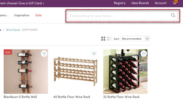
- Search box
- Critical for e-commerce
- At the center of the page or at the upper right hand corner of the primary nav
- A magnifier glass icon would be nice to have
- Forms
- Calls to action block
- Form fields are not required unless indicated
- If you do not have an red asterisk (*) or the word "required" by each input field, people do not assume that they're required
- Free means free
- People don't assume they have to pay or even enter the credit card to access the trial
- Header and footer
- Both sections are clearly demarcated with consistent and distinctive visual style
- Provides visual clue when you get to the top/ bottom of the page
- Elements contained inside the header and footer do not change
- * might excluded from dedicated landing pages for specific marketing campaigns
- Logo
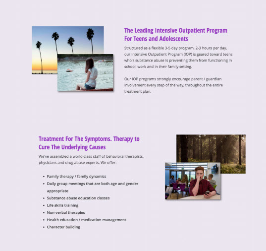
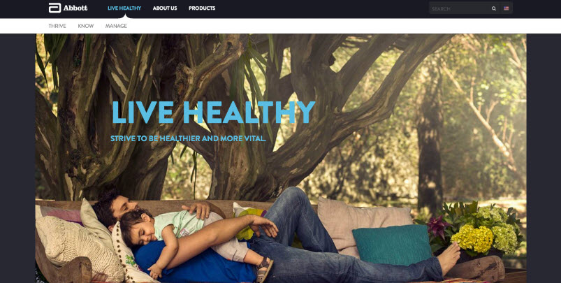
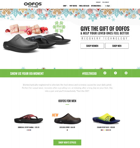
Using Videos, Graphics and Imagery
- Main purpose: to increase Landing Page Conversion rates
IMAGES AND GRAPHICS: THE LIMBIC SYSTEM’S FAVORITE ASSET
- Imagery is the number one component that will give visitors a good first impression.
- Proper use of imagery and graphics can spell the difference between users staying and users leaving
- Ecommerce: the more the merrier
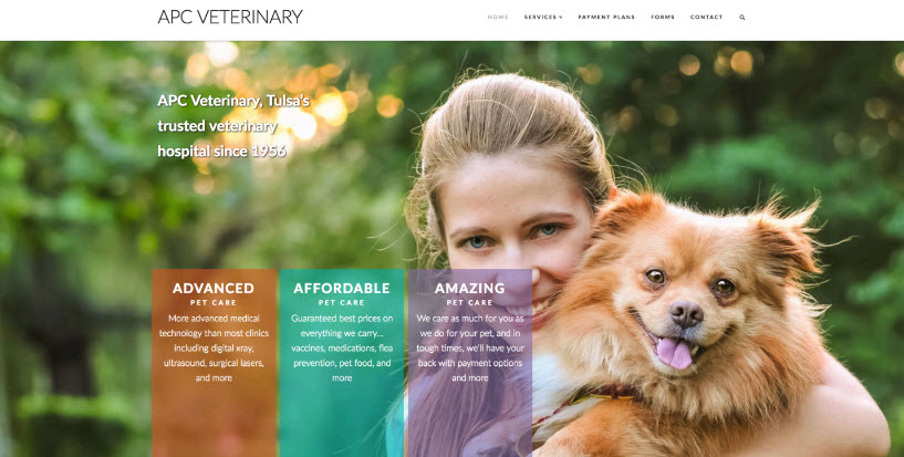
Images Improve Conversion Rate When:
- They tell a story
- They support the product or service based on conventional understanding
- They evoke emotions
- They help clarify a confusing concept
- They are high quality, original and give your site a professional look
Images Decrease Conversion Rate When:
- They make text harder to read
- It's unclear what the image is ("Don't make me think")
- They are not inline with the brand aesthetic and messaging
- They look like typical stock photography
- There are too many of them
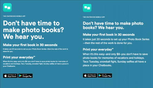
Background Images Tips and Tricks
- Overlapping images create a professional feel
- Use a solid background container for your text on top of an image.
Use a colorful overlay that matches your brand style, reduces brightness and complexity of the image.
Use a solid black or white overlay with an opacity level of 80-95%. Very professional look while not reducing readability.
- Position your background with CSS while floating / aligning your overlay text on a solid part of the overall image
- Use a gradient overlay (css / photoshop) to create a transparent to solid fade over your background image.
- Blur the background image enough to let the text be prominent and clear but not too much that you lose the concept of the image
Combine multiple ideas to be creative and unique while not interfering with an easy user experience
Images can (and should) be able to replace text
Can your images describe your target market? Your price point? Your level of expertise?
Don’t overlook icons and thumbnails
Icons and thumbnails should be used to create a sense of structure, cohesiveness and organization
Add interest and visual appeal
If you see an area of your landing page with a lot of text, try adding subtle and supporting images or graphics to break things up and help make the text more digestible.
Use alternating columns
Alternating image and text columns help break up sections and define content containers.
Don’t miss an opportunity to evoke emotion
- What does this picture do for the brand? Any idea what they even sell?
- Better
- Better
- A Word About Video
- When done right, can have huge impact on conversion rate
- Appeals to visual and audio learners
- Don’t autoplay your videos - it’s just annoying
- High production quality
- Keep it short and simple
- Maximum duration: 1 min to 90 seconds for explainer video
- Corporate video can be longer
- Relevant and informative
- Be careful with bandwidth and mobile devices
- Typically best to use a third party hosting provider like YouTube, Vimeo or Wistia
- Embedding videos in a lightbox pop-ups usually works well.
Information Architecture & Accessibility
- INFORMATION ARCHITECTURE
- The way your content is organized …
- What’s visible above the fold?
- "Above the fold" is the upper half of the front page of a newspaper
- Where is your navigation and how easy is it to use?
- Can a person always find their way back to the previous step?
ACCESSIBILITY
- How easy your site is to use.
- Feedback from elements that should give feedback.
- Providing users with their options.
- Comfort level.
- Legibility
Get your navigation right
- If people can’t find what they’re looking for, they’ll leave.
- Consistency and intuitiveness
Visitors should always be one click away from home.
- Web browsing has no sense of scale, no sense of direction, and no sense of location.
- Convention: click on the logo to get back home
Good navigation tells users what the site contains how to find it.
- Use parent categories to group categories and to create an intuitive information architecture.
- Use parent categories to group categories and to create an intuitive information architecture.
Breaking down the main elements of persistent navigation
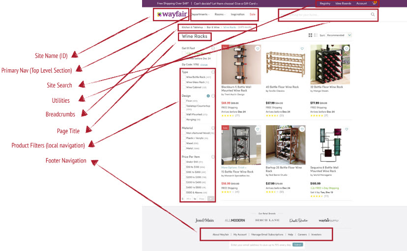
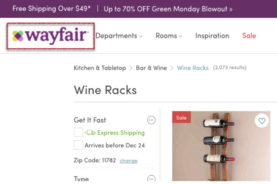
- Site Name
- Near the upper left corner
- Site ID tells me I’m still on the site
- Frames the entire page
- Should look like a conventional ID (logo, distinctive visual, tagline)
- Should click back to homepage
- Sections (Primary Navigation)
- Links to all the main sections of the site.
- Should be across the top of the page (sometimes fixed)
- Should be used for grouping
- “You are here” visual indicator very important
- Differernt text color
- Visual effect like button was pressed
- On every page (except some key conversion pages)
- Site Search
- Appeals to search dominant users
- “Search” or magnifying glass icon
- Frame the box!
- Autocomplete is great
- Allow for common spelling errors
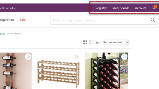
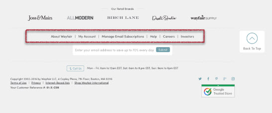
- Utilities
- Links to areas of the site that are not part of the main information architecture.
- Sign in, register, shopping cart, about us, FAQ’s, sitemap, directory, store locator, jobs, order tracking, press releases, discussion forums, limited time promotion etc.
- Should be less visually prominent than other navigational elements.
- Should be the only things above the logo.
- Only include the most common utilities at the top - the rest go in the footer nav
Breadcrumbs
- Easily gives visitors the ability to go back one level or go home
- Important in e-commerce
- Bold or highlight the current level
- “>” between levels (conventions)
- The deeper the hierarchy the more useful breadcrumbs are
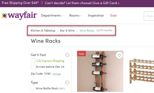
- Easily gives visitors the ability to go back one level or go home
Page Title
- On every page, framing the content of that specific page
- Prominence - should be the largest text on the page
- Gives visitors a subliminal sense of location
- Footer Navigation
- List of primary page links
- Contact info
- Additional site utilities
- Social icons
- Newsletter signup
- Privacy policies
- Sitemap
- Site Name
- A Few Quick Words on Accessibility
- Contrast
- Make sure you have lots of it.
- Bad
- Contrast Checker
- Input a background color and a foreground color and will rate the readability based on contrast
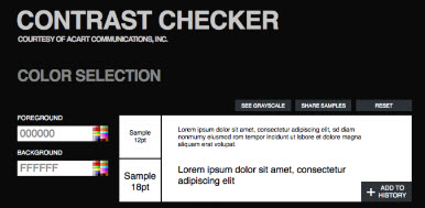
- Input a background color and a foreground color and will rate the readability based on contrast
- Feedback
- Things that make things happen should have something happen to them when interacted with.
- Classic example, a button that is clickable
- when hover over a button, mouse pointer change (color/hand), background color of button changes, shadow appears etc.
- Typography
- Typography should go unnoticed 9/10 times. It shouldn’t be something your visitors think about or even remember.
- Sans-serif better than Serif
- Times new roman are harder to read
- Fonts: Open Sans, PT Sans
- Don’t use more than 2 font families
- Avoid excessive capitalization
- Avoid inverse color schemes (dark BG with light text)
- Use lighter background with darker text
- Avoid multiple text colors
- Don’t underline text that isn’t a link
- Start with 14pt - increase a few points for an older audience
- 50-100 character max line length
- Contrast
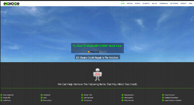
Trust, Safety & Creditability
TRUST, CREDIBILITY AND SAFETY: FOCUSING ON INTANGIBLES
- A users likelihood to convert is directly related to how trustworthy your site feels and appears
- Trust and safety is an initial impression formed within a second or two of arriving on your landing page
- Because websites lack the fidelity of a face to face relationship, there is a built in anxiety that you’re not trustworthy (guilty until proven innocent)
- Elements that increase trust are subliminal in nature and they’re hard for even users to pinpoint during a usability test
- Run real world A/B tests to see improvements in conversion rate
- Follow best practices blindly! They will work in your favor
- Example
Professionalism and Refined Aesthetics
- We do judge books by their covers
- This is the hardest thing to get right (it’s an overall sort of thing)
- Neatness, organization, high level of polish to your site all combine to create a sense of professionalism
- Clean typography, white space, professional imagery
3 Sites That All Sell the SAME Thing
- Site 1
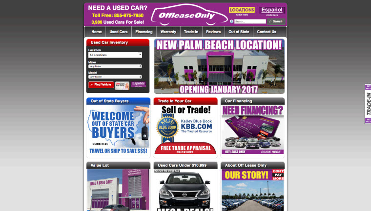
- Site 2
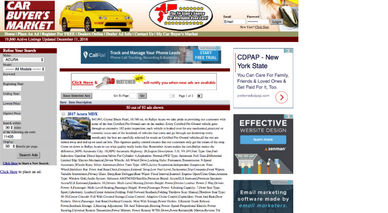
- Site 3
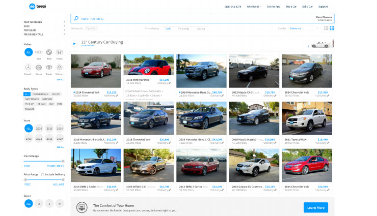
- Usability Test
- Question: Which site makes people feel safer about buying a used car and why?
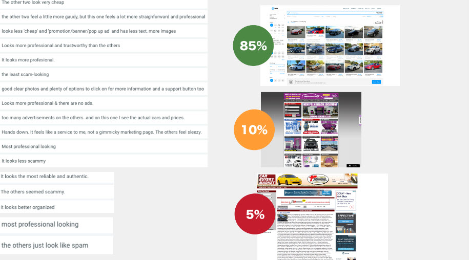
- Question: Which site makes people feel safer about buying a used car and why?
- Site 1
- Transactional Assurances
- Subtle design elements counteract innate anxiety
- Equally important for lead gen and e-commerce
- Needs to be prominent before the conversion action
- Concerns and subliminal question marks about trust and safety never really go away
- Demos and free trials are one of the most popular and successful ways of counteracting transactional anxieties
- Guarantees and Policies
- Refund policies should not be obscure, unclear or hidden
- Does the company pay for return shipping?
- You won’t use sell or use my email or phone number for any other purpose
- Multiple payment methods and options
- Price match guarantees
- Safety Logos
- If you think they are overrated, think again.
- These logos are subconsciously expected, even if users can’t put their finger on it.
- Relieves anxieties about entering payment methods
- Include them above the fold and definitely in the checkout process whenever possible.
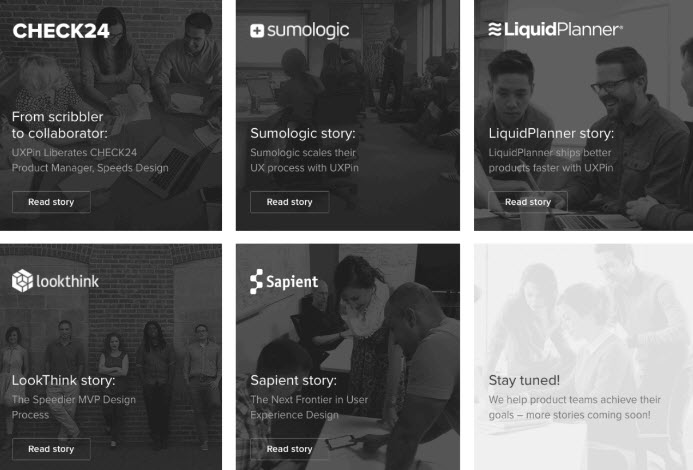
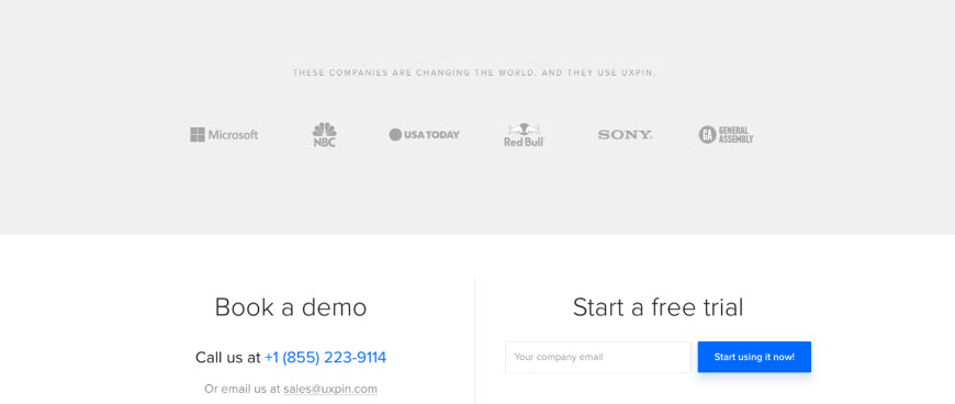
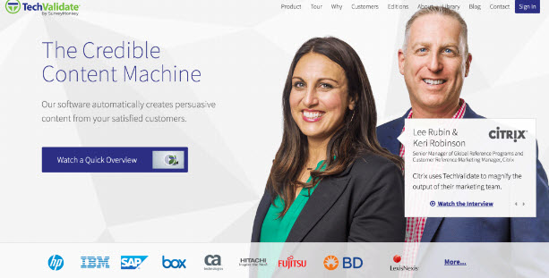
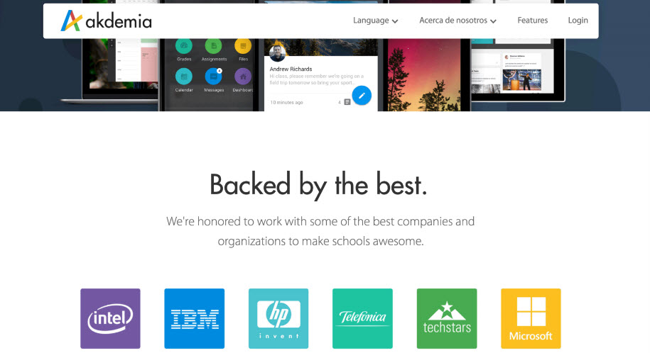
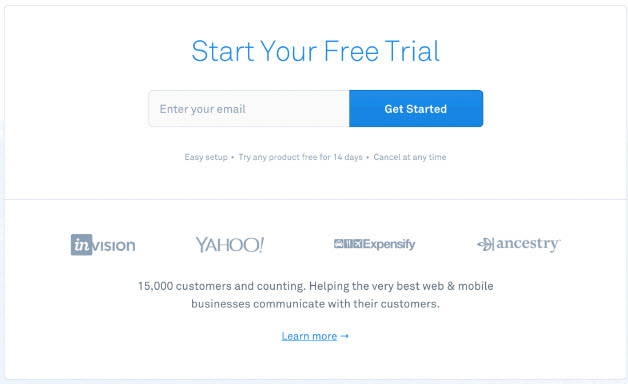
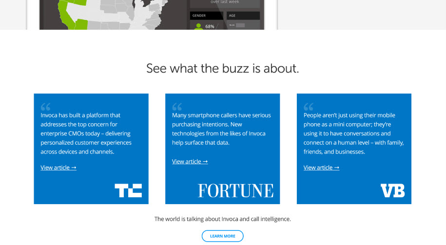
- Clients and Media
- Your visitors don’t know you yet. These are ways to increase trust (as opposed to decreasing anxiety)
- Awards / achievements
- Media mentions
- Partnerships
- Studies and surveys
- Client lists and logos
- Example
- Example
- Example
- Example
- Example
- Example
- Example
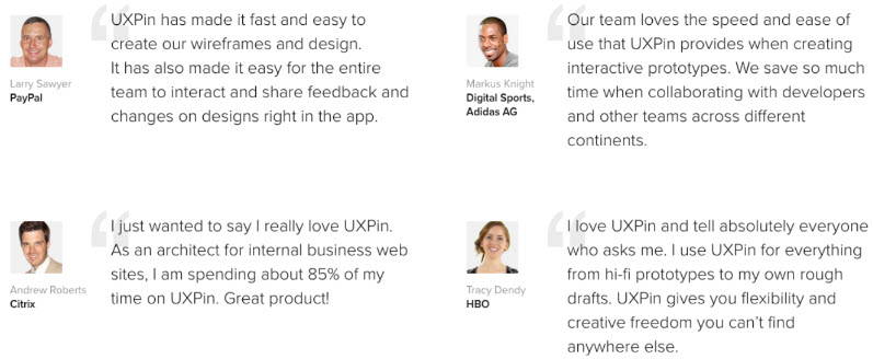
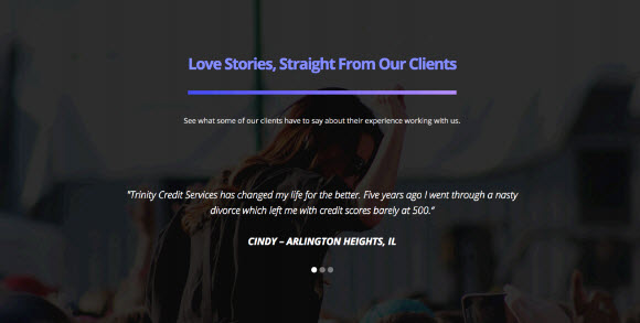
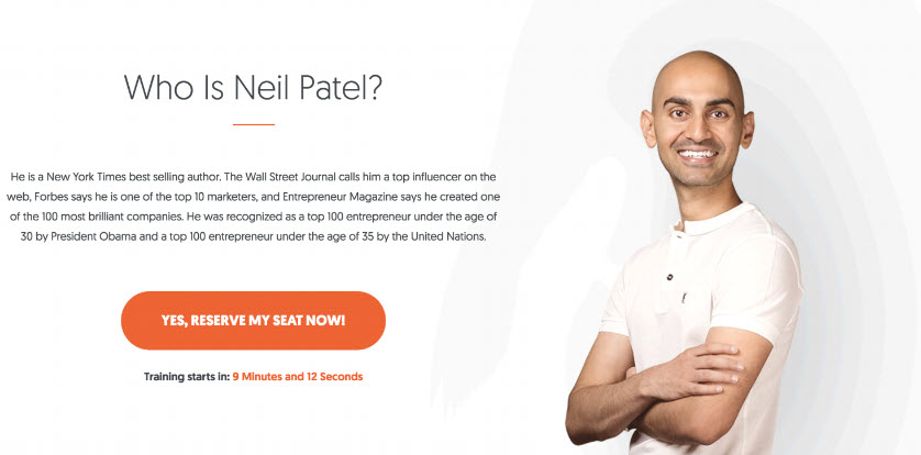
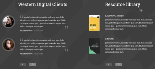
- Social Identity and Customer Reviews
- The decisions and tastes of our friends have a strong influence on our own consumer behaviors.
- “The Many”: Objective numbers indicate leadership in a given space. Powerfully influential.
- “The Comparable”: The more you identify or relate with another, the more likely you are to be influenced by them.
- The key to testimonials effect is to create a sense of identity (the comparable).
- If you can convey numbers with social identity - you win social proof.
- Example: The Comparable
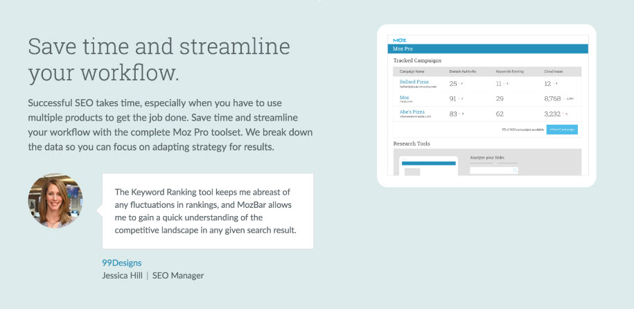
- Example: The Many
- Example:
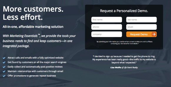
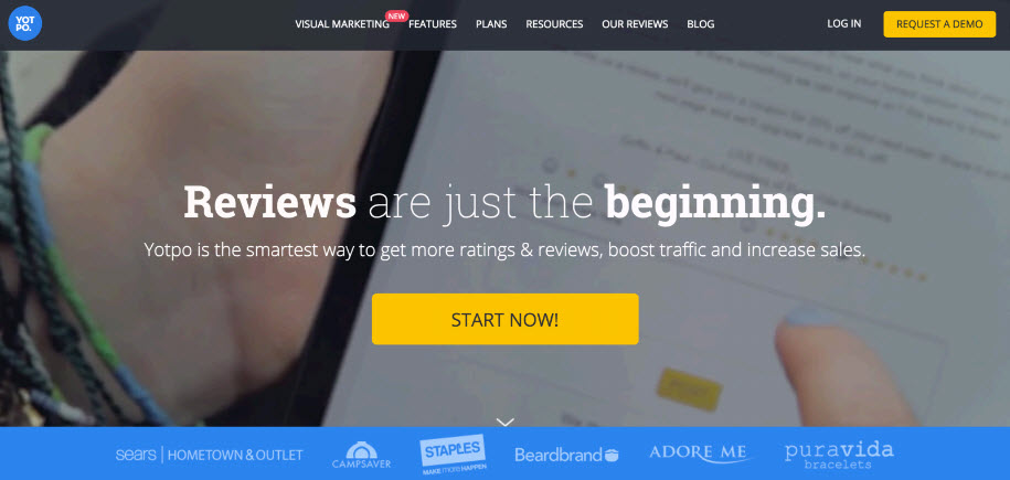
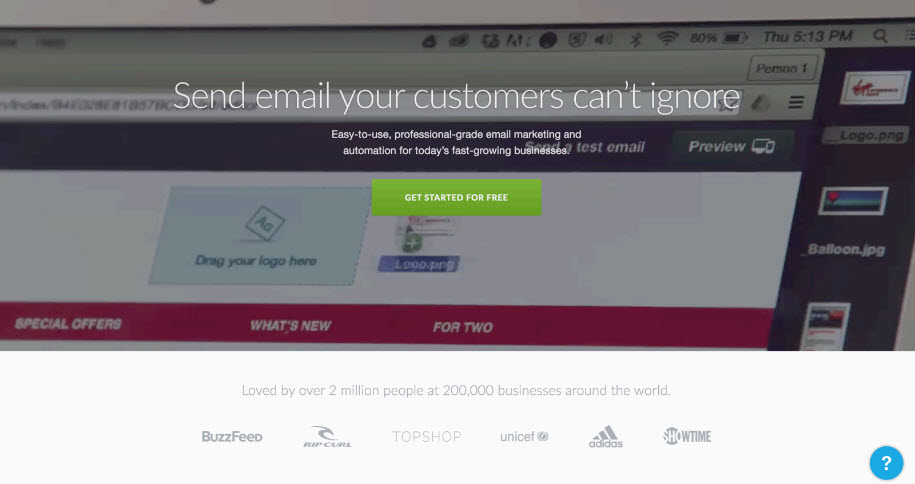
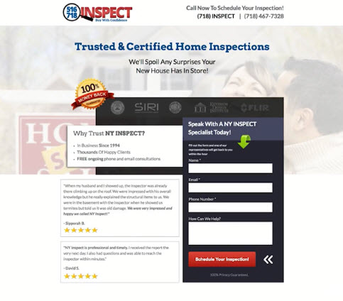
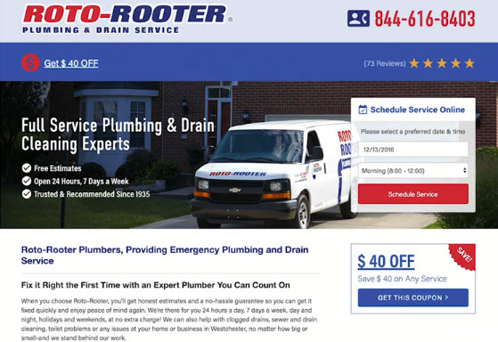
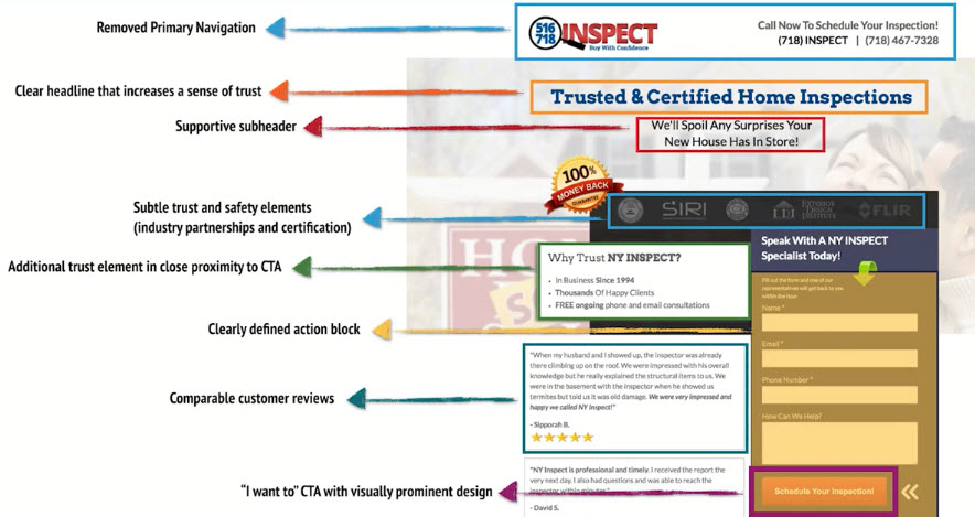
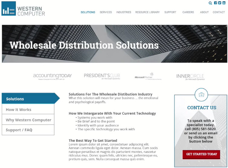
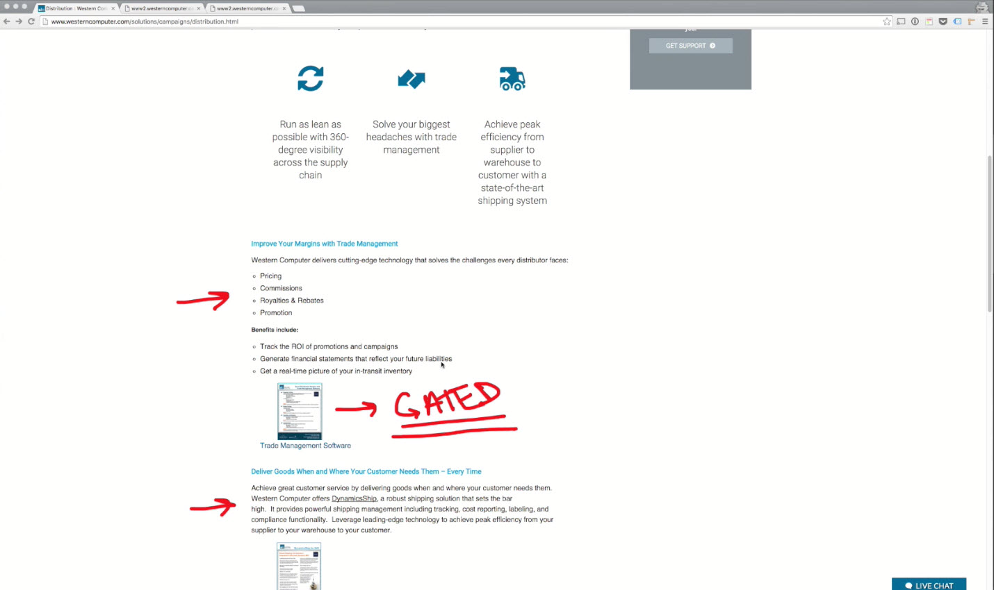
Dedicated Landing Page Design - Best Practices
- THE DEDICATED LANDING PAGE
- For PPC and specific marketing campaigns, dedicated landing pages are crucial
- Also known as "Direct Response Pages"
- Centers around one specific conversion action like a sales form or content download
- Very important to capture attention immediately (more than main site pages)
- Testing is easy with
Unbounceand tools likeOptimizely, Visual Website Optimizer(VWO)andGoogle Optimize. So TEST! - Don’t overlook the value of a legitimate email address
Dedicated Landing Page Best Practices
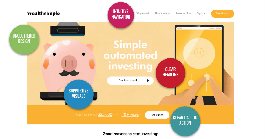
- Clear and Unmistakable Headline
- Headlines on dedicated landing pages serve to capture attention immediately (different then their typical purpose of letting people know what the page is about)
- Headline should be very specific, letting users know that there’s an answer to their question by continuing to interact with the page
- Large font size
- Should direct users to action (almost like the call to action text itself)
- Should be used to increase trust and decrease anxiety
- Action Block / CTA Above The Fold
- On landing pages, always make sure to have your primary CTA or action block above the fold
- You can use resizemybrowser.com to check your screen on common resolutions
- As of January 2016, over 90% of browsers have a screen resolution of 1024x768 pixels or higher
- Include another CTA below the fold, above the footer section
- Remove any Excess Text and Highlight Primary Features
- Most landing pages are attracting first time visitors - you have very little time to capture their attention
- Highlight key benefits and features below the main headline (don’t focus on common characteristics that don’t distinguish you from all the competition)
- Answer your visitors’ primary question(s)
- If you have any paragraphs of copy, they should be even shorter than the paragraphson your primary site
- No clutter, no yelling
- Trust, Trust and a Little More Trust
- Landing pages tend to have an increase in anxiety since by definition, you’re trying to elicit a specific conversion action (direct response)
- Testimonials, client logos, media mentions and guarantees
- Trust symbols should be in close proximity to the conversion action
Explainer Videos Work Great on Landing Pages
- The less committed a visitor is, the more likely a video is going to appeal to them (it’s easier than reading)
- The more professional the video the better, but you can get started on Fiverr for very cheap to test the concept
- Treat videos like text - short, informative, objective and hype free.
Split up long forms to only include key fields on the first page
- First form on the left, Second form on the right
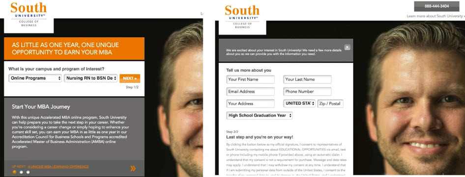
- First form on the left, Second form on the right
- Consistent Messaging From The Upstream Click
- Fulfill promises, no bait and switch
- Offers and promotions should be consistent
- Message match (helps AdWords Quality Score as well)
- Example: Bad design (39.99 vs 54.99)
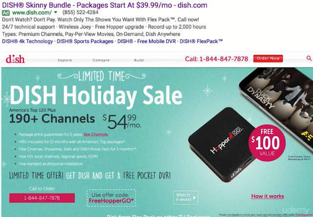
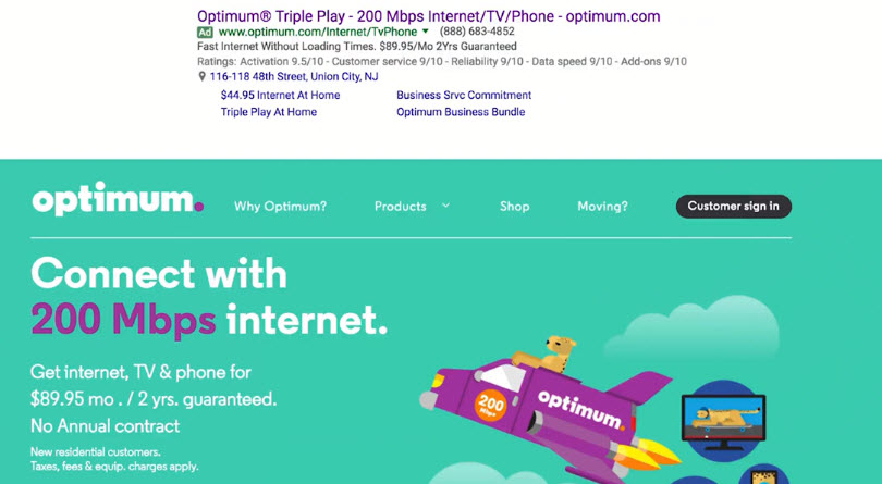
- Example: Good and Consistent
- Clear and Unmistakable Headline
- What Should You Test First?
- Headlines
- Form Fields
- Offers / Promotions
- Call to Action Text
- Images / Video
- Example: Before
- Example: After
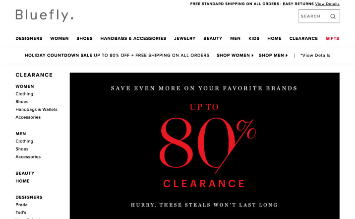
Principles of Persuasion: Scarcity
- Scarcity creates a sense of urgency
- People would rather make a quick decision than risk missing out on a deal
- If people think they can come back anytime to buy your product or register for your webinar, they’re less likely to make a decision now
- You can apply the scarcity principle to physical goods and lead gen campaigns
- Can be time-driven (deadlines) or quantity-drive (availability)
- Don’t overdo it
Use Deadlines to Create Urgency
- Doesn’t have to be a “hard” deadline; can be shipping deadline for holiday sales
- Deadlines for seasonal products (ski vacation packages)
- Deadlines to use a coupon code for a local service
- Deadline to register for a webinar
- Example

- Example
- Example: Soft deadline
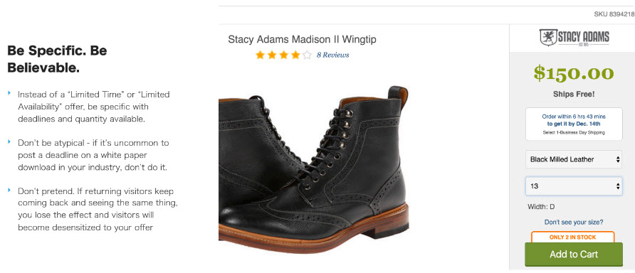
Be Specific. Be Believable
- Instead of a “Limited Time” or “Limited Availability” offer, be specific with deadlines and quantity available.
- Don’t be atypical - if it’s uncommon to post a deadline on a white paper download in your industry, don’t do it.
- Don’t pretend. If returning visitors keep coming back and seeing the same thing, you lose the effect and visitors will become desensitized to your offer
- Example
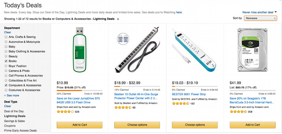
- Example: Amazon Today's deal with availability bar
Reciprocal Concessions & Reciprocity
- Reciprocal concessions are instances where you offer a product or service that’s too expensive (asking for too much) which the visitor refuses (you concede). He is more likely to concede to you on the cheaper option.
- Reciprocity is a feeling of indebtedness caused by even small token gestures or gifts.
You’re Less Likely to Say “No” Twice
- The requester lowers his initial request, making it more likely that the subsequent request is accepted.
- Under the psychological contract of reciprocity, we should concede to someone else once they’ve made a concession to us (turning down the initial offer appears as a concession on the part of the asker).
- “Door In The Face Technique”. Your first price or package can be too expensive (almost surely rejected) and the second option will be more likely accepted
- The first option (the door in the face) can’t be too unreasonable, otherwise the rejection of that option won’t be seen as a concession.
- Example: Early bird pricing
- Why not just offer early bird pricing?
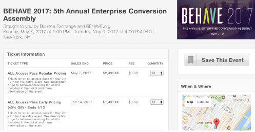
- Why not just offer early bird pricing?
Reciprocal Concession Ideas
- Email your prospects list with discounted prices based on previous offers
- Create a second package with additional features not usually important to the majority of your customers
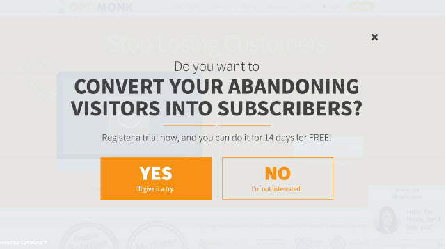
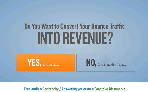
- Yes / No Exit-intent popovers
- Offer a paid signup, then a free trial
Reciprocal Concessions + Anchoring
- In decision making, an anchor is the first or most prominent option presented
- People have a tendency to rely heavily on an anchor, evaluating subsequent options within the context of that initial anchor or option
- Commonly used with pricing
- Offer the most expensive option first (anchor)
- You can even offer something you really don’t intend to ever sell e.g. \$299/mo package shown below
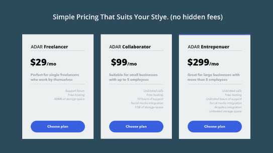
- Good use of anchors allows you to convert more users for a higher profit than without the anchor
Anchoring and Cognitive Dissonance Theory
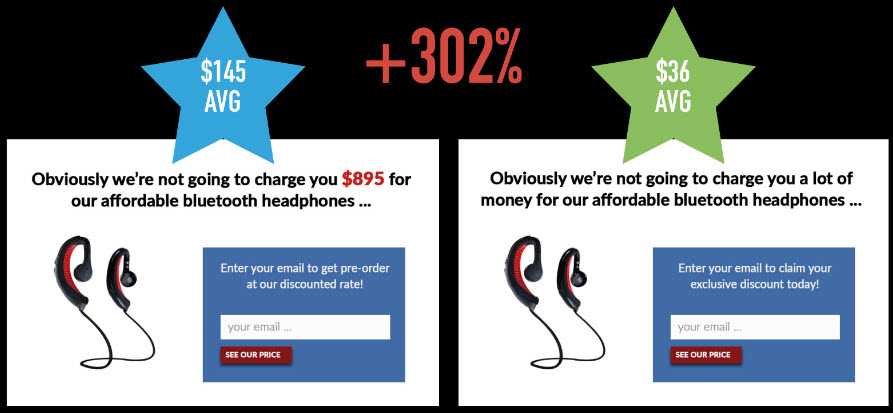
Case study
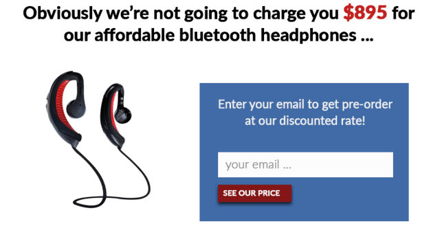
Ask two separate groups of people the question "How much do you think we’re selling these headphones for?"
With anchoring
Without anchoring
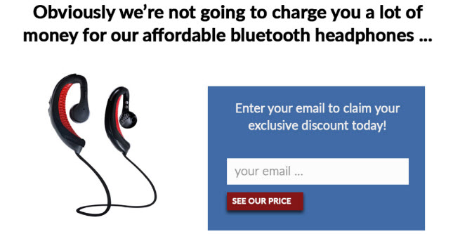
Results
Engendering Indebtedness
- People want to return good will, even if it was a small, token gesture
- By giving gifts or extending yourself to your visitors, you can engender goodwill and a sense or reciprocity
- Chocolate / waiter study (2002)
- Don’t have strings attached, don’t ask for anything in return
- Free advice, free tools, trials, content previews, free resources, ebooks and white-papers, consultations, audits and additional perks are all gestures that will create a desire to reciprocate
- Example: Reciprocity (people want to return a favor)
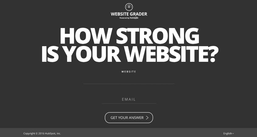
- Example: https://website.grader.com/
- Example
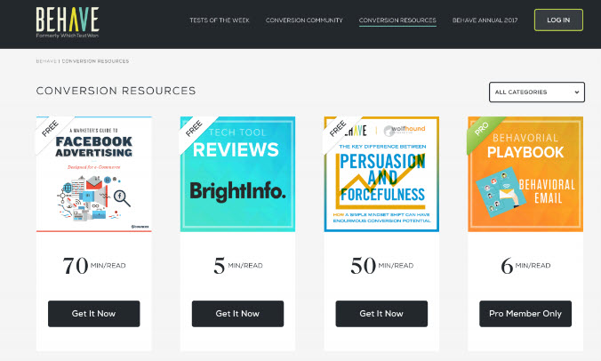
- Don’t Underestimate the Resource Library!
Cognitive Dissonance Theory Works Well With Reciprocity
- People are inclined to not live in contradictions. People want their behaviors (past, current and future) and beliefs to be consistent
- We will rationalize and behave in ways that will not contradict our previous behavior and efforts
- You are more likely to be a client of mine than a stranger because of cognitive dissonance theory
- The more a prospect engages with your website, the more likely they are to be committed to you for your paid services / products
- Example
- Example: Assessment offer
- Example: Assessment offer
- Cognitive dissonance theory can be applied to headlines
- Cognitive dissonance should always be applied with positivity, making people feel good about themselves (nothing punitive)

User Scenarios & Contextual Perception
EMPATHY
- Persuasive techniques are only effective if you understand your visitors
- A lot of what you think about your visitors is probably wrong
- They’re often not the people you think they are
- They do things differently than you’d think they would
- They often times have different needs for your products than you think
CONTEXTUAL AWARENESS OF YOUR VISITORS
- In order for you to truly enable your visitors to accomplish their tasks, you need to be aware of who they are.
- What led them to your site?
- How much knowledge do they have?
- What are their anxieties?
- What are their expectations?
Who Are They?
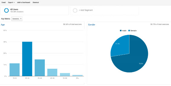
- Demographics, interest groups, affinity audiences. Visitors don’t have name tags so you need to use aggregate data from analytics
- Age, gender and ethnicity can have a major impact on your messaging and design aesthetics
- On site behavior and conversion rate can vary greatly by demographic group
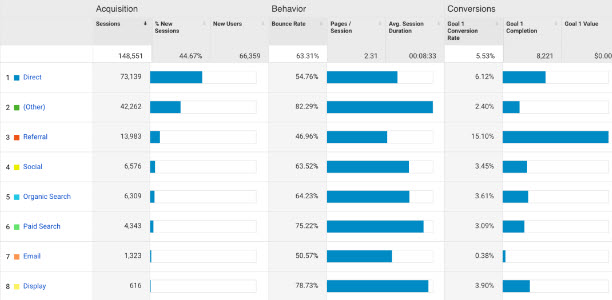
Where did they come from?
- Different traffic sources bring in visitors in different stages in the funnel (susceptible to different persuasion frameworks and triggers)
- Social media tends to bring in curious, uncommitted, top of the funnel traffic (ads vs organic make a big difference)
- PPC offers a lot of control and you should have a sense of who these people are
- Organic offers less control, but your analytics can tell you which keywords you’re ranking for
- Email can bring in highly engaged traffic, but you should still have a sense of the demographics of your email lists
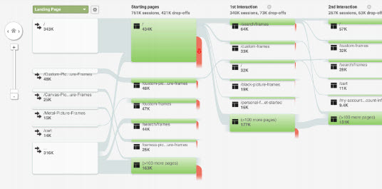
User Scenarios
- Personas are the role of the person (small business owner), but scenarios also take into account the context of their visit.
- What brought them to the site? What was their underlying concerns or fears? What are their desires and motivations?
- It’s not just task oriented - different people will approach the same task differently.
- Behavial Flowchart
Creating User Scenarios
- Bring together anyone in the company who comes into contact with prospects (regardless of the stage of the prospect)
- Each person (or just you) should write a brief description of the person (demographics)
- Write a detailed role for your target: Who are they? What are their anxieties? How price conscious are they? What stage in the funnel are they in?
- Write a detailed intent: What are they trying to accomplish on your site? How do you imagine them accomplishing their desired task? Do you imagine them converting? If so, what will it take to get them to convert?
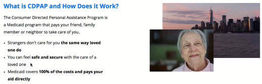
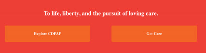
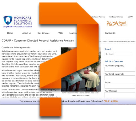
Exercise: Creating User Scenarios for CDPAP
- You should not be writing out an entire scenario!
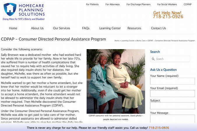
- Example Scenario for CDPAP
- Summary: visitor is the daughter of an elderly patient who needs help every night administering insulin shots. She’s in her middle 40’s, lower income bracket. She’s on medicaid and saw an ad on a billboard for the NYS CDPAP program
- Role: She is anxious about getting her mother a home health aid who’s a stranger - her mother doesn’t do well with strangers. She feels hopeful that she can take care of her own mother and get paid to do it. She’s a little skeptical that this is a legitimate program. Overall she’s very anxious to get her mother care either way as soon as possible. She’s early in the funnel, but can make a decision very quickly.
- Task: Find out more about the CDPAP program, understand how it works and if she’s eligible to enroll. If she is, she wants to enroll and start getting paid to care for her mother immediately. She wants the process to be simple and quick.
- Conversion Path: Look for insurance information, endorsements from medicaid and NYS and how to enroll.
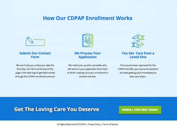
- Walk In Their Shoes
- Go back to your landing pages with the user scenarios you and your team put together
- Look for commonalities and trends (stage in the funnel, age, ethnicity, anxieties, motivations)
- Assess your information architecture: are you providing the information that eases anxieties, answers questions, and provides a sense of affinity?
- Close your eyes and imagine YOU are your visitor - what obstacles will you face, what questions will you have, what elements of your site will cause you frustration?
- Come up with ways you can lay out the information and design the conversion path in a way that makes more sense to your visitors - not to you.
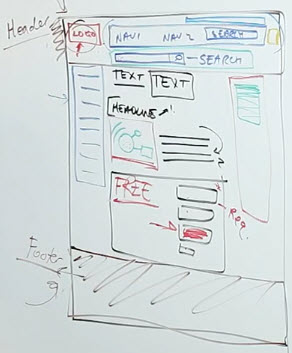
New Design
- Hero Section
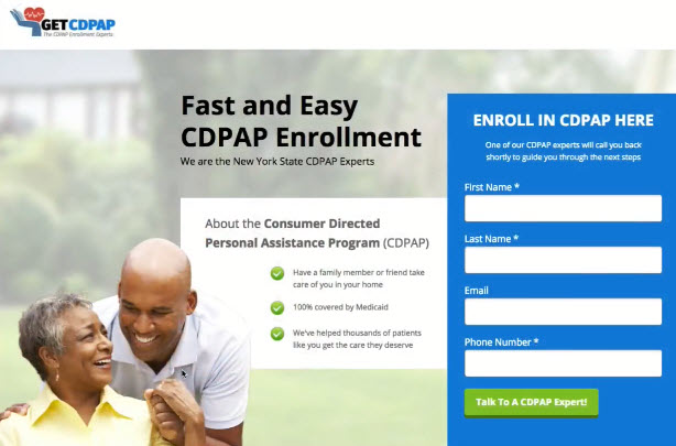
- Contents

- Footer (with shadowing)
Design & Building a Landing Page in Unbounce
Landing Page/ Web Site Builders
- Unbounce: https://unbounce.com/
- Need to manually adjust for mobile layout
- Webflow: https://webflow.com/
- New kid on the block
- Most advanced features but with steep learning curve
- Shopify: https://www.shopify.com/ and SquareSpace: https://www.squarespace.com/
- Good for e-commerce
- Build full website, like simpler version of WordPress
- Not a dedicated landing page builder
- LeadPages: https://www.leadpages.net/
- Similar to Unbounce
Bonus: Landing Page Design Best Practices
Site speed
- Proper sized images, icons
Production quality
- Gives you the first impression
- Feeling lost? e.g. What you actually do
- Resolution: add a tag line
- Find what you want?
- Images meaningful?
- Call to action ("action block") i.e. contact us, support, live chat
Layout & Contents
- Clarity of the headline, sub-headline
- Add Secondary Navigation menu if necessary
- Contents
- People do not read, they scan
- Where do the upstream came from?
- Use buzz words, bullets
- Tone should be easy, simple, straight forward
- Image: not too distracted
- Feature/Benefits Section
- Put in own section with a headline
- Whitepaper/eBook offers
Don't let people think
- Use
sliderso that visitor don't have to scroll to much down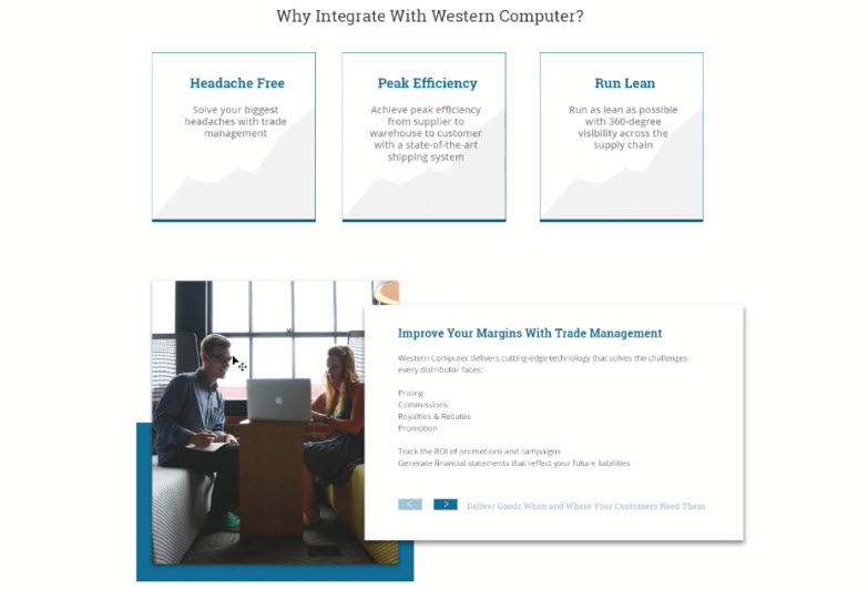
- Text size on different screens
- Space between elements
- Trust & Security
- Include client testimonials, awards, certifications etc
- Use symbols or icons, very powerfull
- Consider using
opacity, not too distracting